More interesting than it sounds
When I mentioned to people that I was working on a financial app, I think they imagined something Financial apps may not sound like the most interesting thing to work on, but the thing I love most about consulting is diving deep into a new field. Even among financial apps, private securities are a unique challenge. Private securities are shares of stock in a company that isn't publicly traded, so while it's easy to get a price for a company on the stock exchange, private companies require a lot more expertise to estimate the value with authority.
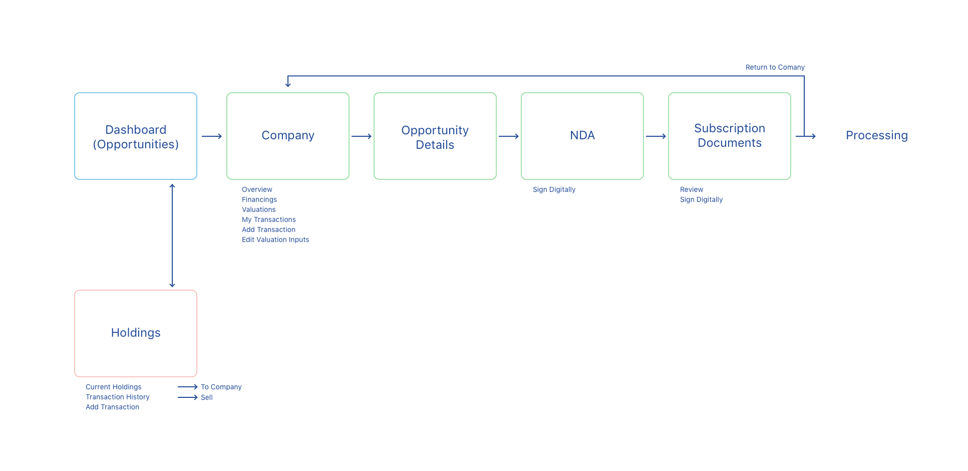
This company is the largest marketplace of private securities, and to maintain that position they approached thoughtbot to build a new platform. The new app would make the most of the relationships that their users have with their brokers by providing up-to-date information on companies and opportunities that might be interested them. So for instance, it would display investment opportunities that the broker has marked specifically for the user based on their conversations. It would show news stories relevant to companies they have invested in or are watching. And most importantly, it would make it easy to let your broker know that you are interested in acquiring or selling stock in these companies.
Demystifying the strange world of stocks
As with most projects at thoughtbot, we started with a week-long Product Design Sprint. Two developers were with the client in our San Francisco office, while another designer and I joined remotely using Google Hangouts.
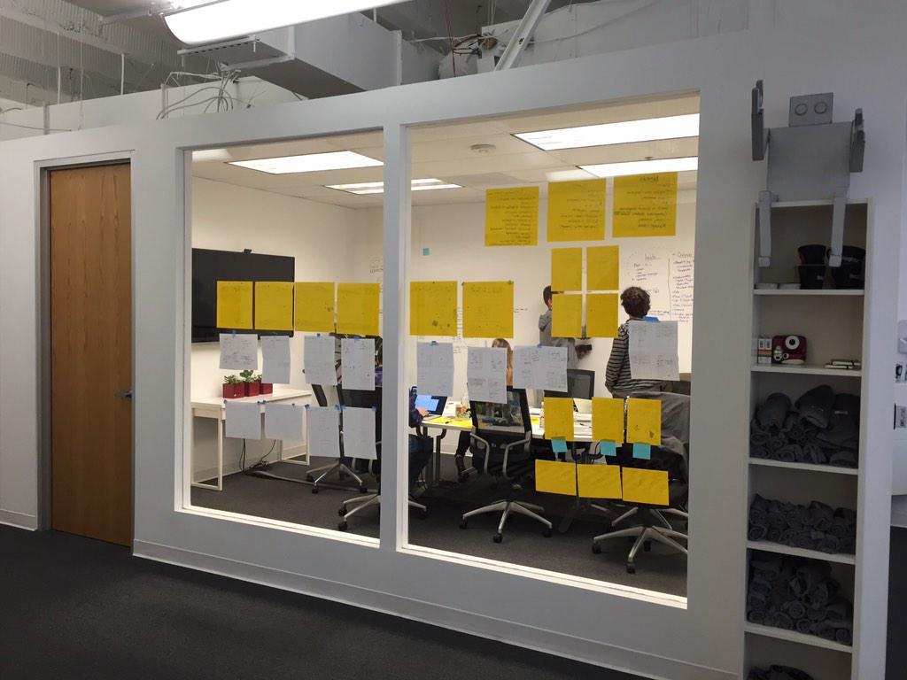
I had done remote design sprints where I was the only one remote, which usually ends up a little awkward. With half the team being remote, we were diligent about uploading photos of sketches directly to the Trello board we had set up for the sprint via the Trello mobile app. This has the bonus of forcing you to upload everything for documentation, which comes in handy during prototyping and even later in the project. You never know when that one idea from a random sketch might come in handy later. Having two designers on the same end also meant that we were able to quickly toss around ideas and soon all of the whiteboard walls were covered in sketches and flows.
We usually like to start designing in the browser as soon as possible, but since the developers had some very complicated back-end code to figure out we spent time polishing the wireframes into high-fidelity mockups. These mockups were refined in InVision so we could give the client a realistic look at how the views were connected.
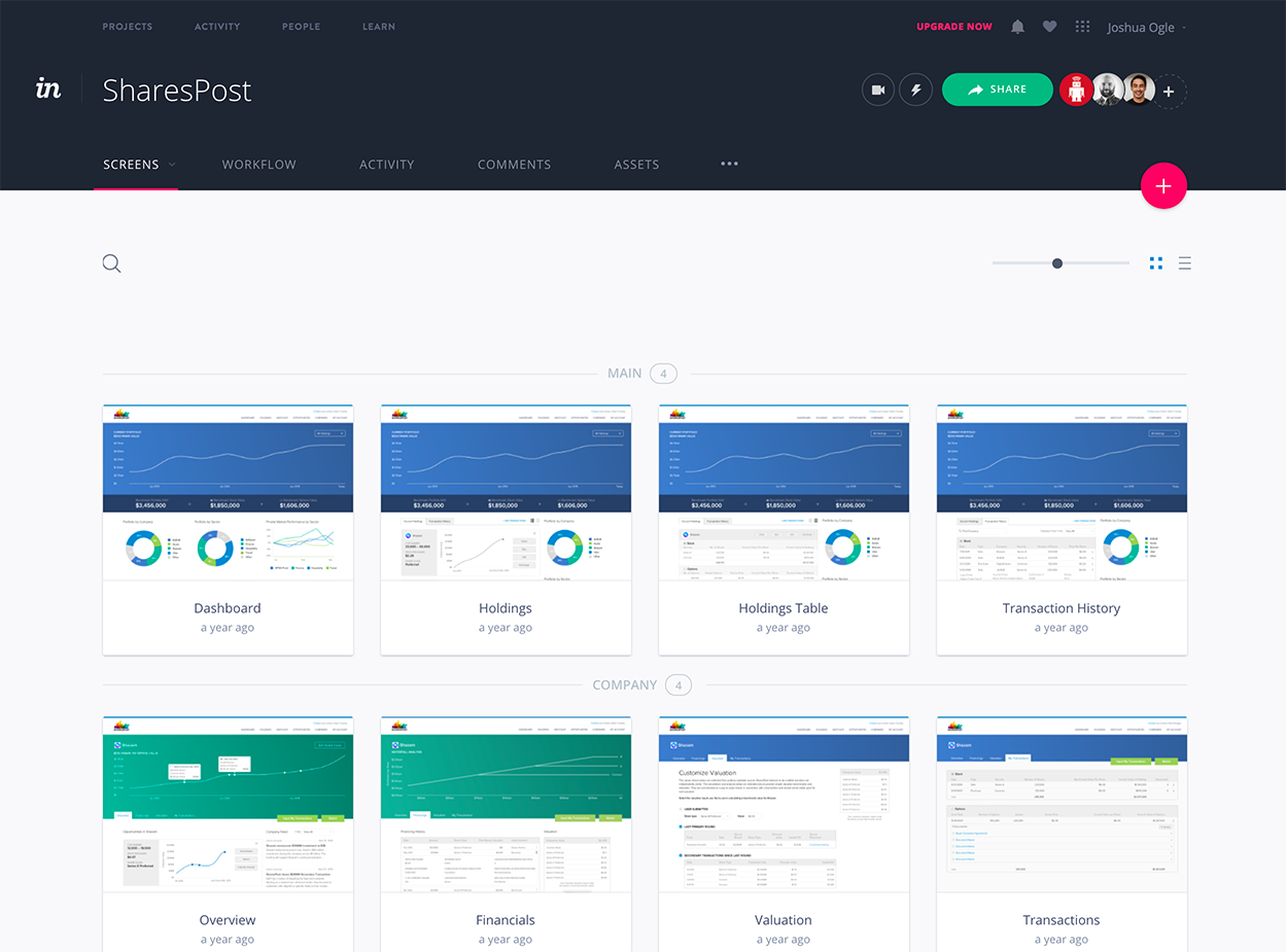
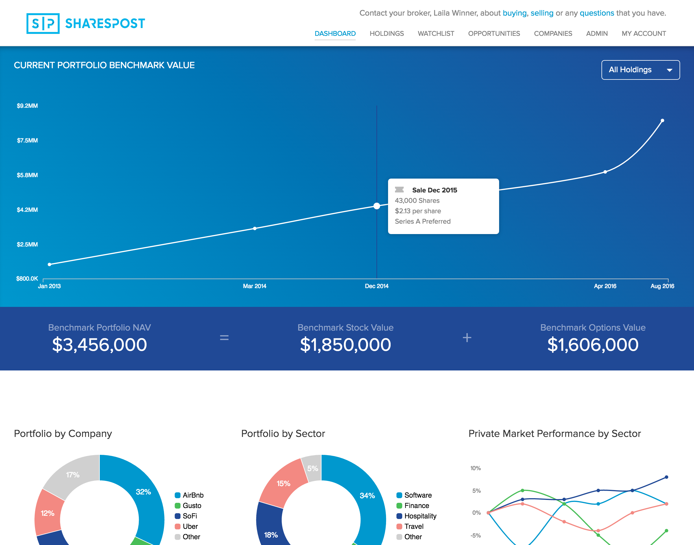
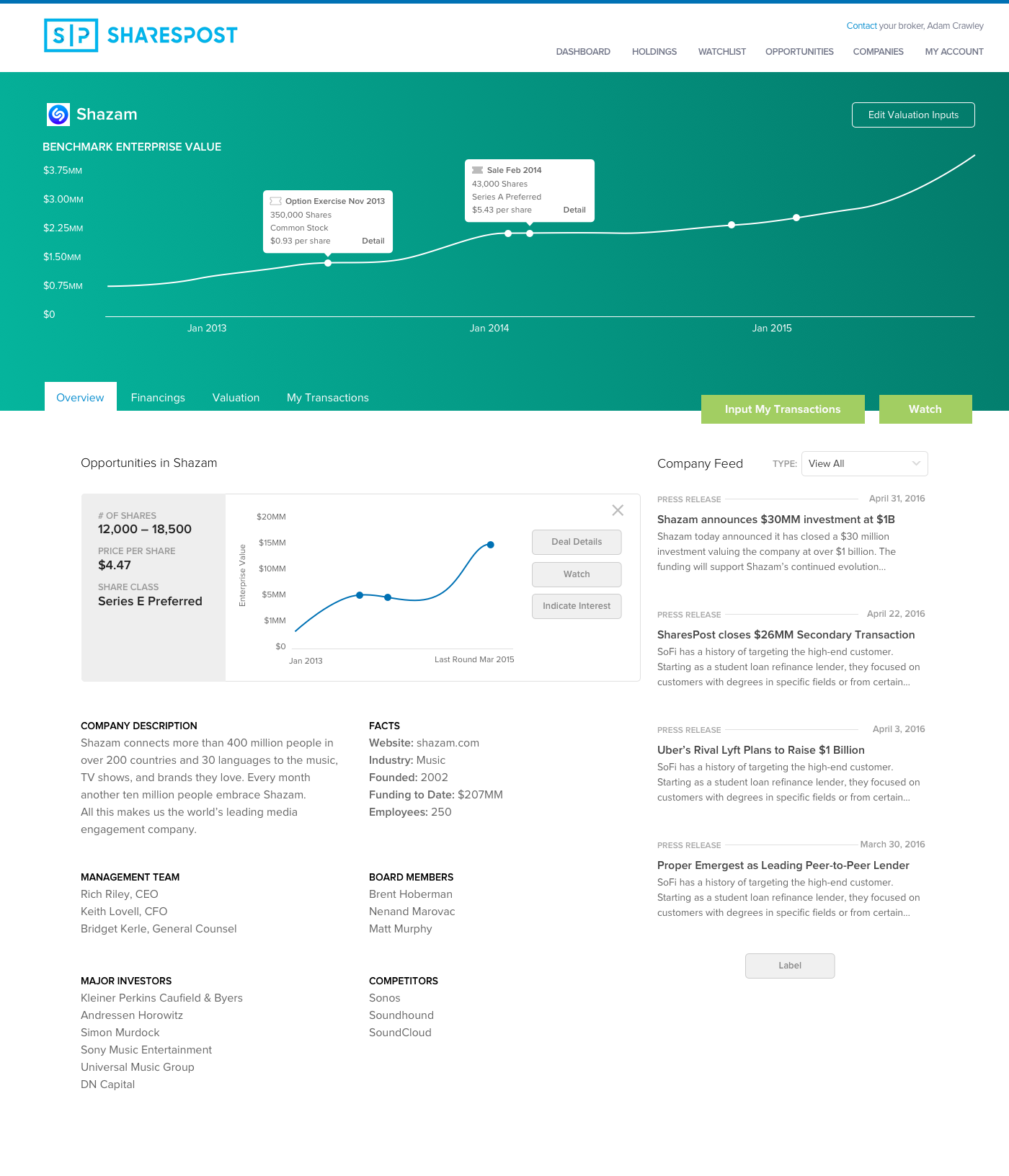
Here's a look at one of those mockups. The home page prominently features an “Estimated Valuation” chart to summarize the user's portfolio over time. If the user is new and hasn't purchased any stocks yet, they get a friendly welcome message instead. Some of the tabs on company pages feature this kind of chart at the top too, giving a nice summary before they dive into the details.
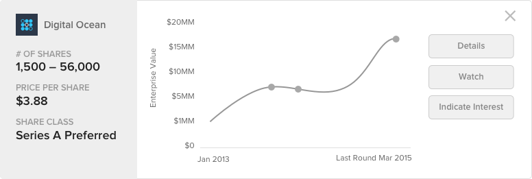
One of the repeated design patterns around the site is the use of cards to contain information related to an opportunity. The company name and logo give a nice visual differentiator, as well as a large graph that shows the estimated valuation of the company over time so you can tell at a glance if this is a good investment. Buttons on the right give easy access to actions the user might want to take, including asking their broker to start the process of buying the stock.
Since we started the project with two designers, we were able to create the styleguide and design patterns much quicker than most projects. As the developers caught up the views then came together quickly. It was a rather complicated user interface, so we weren't going to have all of the data ready at once. It's important to start getting user feedback as early as possible, so we put together a plan to deploy the pieces of the interface as they were ready. With a set of feature flags and a flexible layout system, we iteratively released the new system to VIP members for testing.
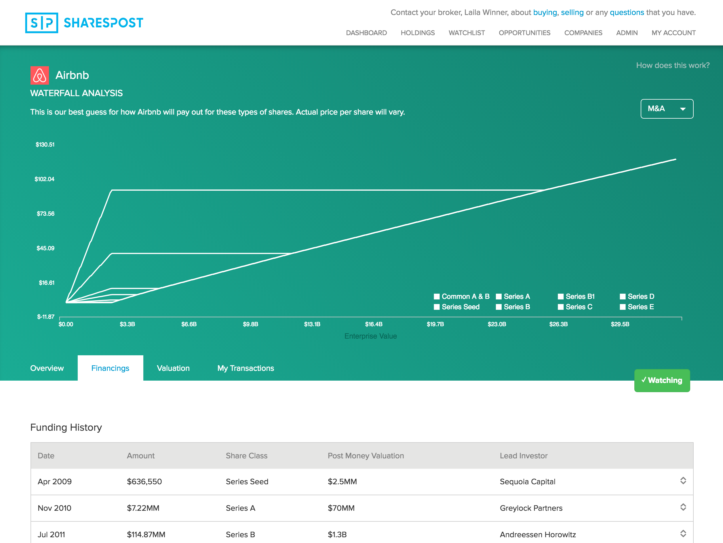
The piece that took the longest was the waterfall chart. Depending on the class of your shares and when you acquired them, they would be valued differently. It went through a few different design versions to make sure it was as clear as we could possibly make it. As far as I know, no one else provides this information in such a clear and interactive way. I designed the charts and wrote the javascript for them, and then the developers fed in the data in a simple format. The back-end that provides the data for this piece is extremely complicated, and frankly I'm glad I wasn't the one working on it.
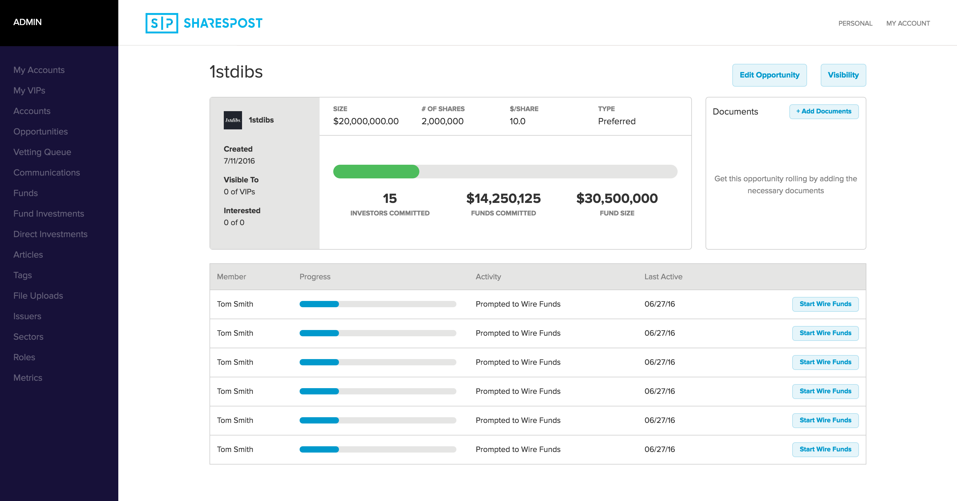
With all of this data, the brokers and admins needed a system to help them manage it all. We developed an admin system that makes it all simple and works well on mobile too. They could now easily edit company information, select opportunities for individual clients, and add items to the news feed from one interface.This made their jobs much easier and they were excited to start using it.
The best of both worlds
This was probably the most complicated app that I worked on while at thoughtbot. The client had worked with us on another project and understood our process.Having someone who is able to communicate expectations to the rest of the company is a huge help.I'm really happy with how well the team was able to organize software with so many moving parts. So far the app has been a big success. It launches Fall 2016, just in time for their busiest season, and I can't wait to hear how it goes.